Walk into a wine shop and inevitably, you’ll recognize patterns in bottle shapes. Before you even read a label or focus on pricing, certain bottles will catch your eye, seeming traditional or modern, classic or exciting. Some will even scream quality from across the room. This is no accident; this is the bottle shape doing exactly what it’s designed to do.
New winemakers tend to obsess over what’s inside the bottle, their blend, their oak treatment, their aging process. While these are critical decisions, what’s often forgotten until the eleventh hour is that before anyone pops the cork, your bottle is telling a story about your wine. If the shape is right, you have this wonderful, silent partner working for you on each and every shelf, helping consumers understand what’s unique about your wine.
Bottle shapes are not arbitrary. They developed over time in specific regions for specific reasons and those connections exist in how we all understand wine. Familiarizing yourself with these connections, and knowing when to embrace them and when to step outside the box, opens up new worlds of possibility as you present your wine to the world.
The Traditional Shapes and What They Convey
Three dominant shapes govern the world’s most common wine bottle sections and each of them tell a different story.
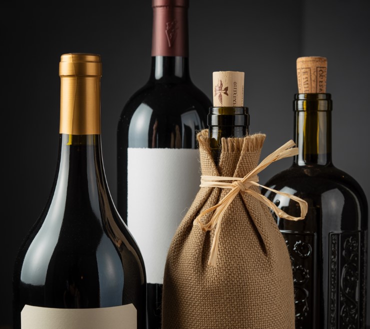
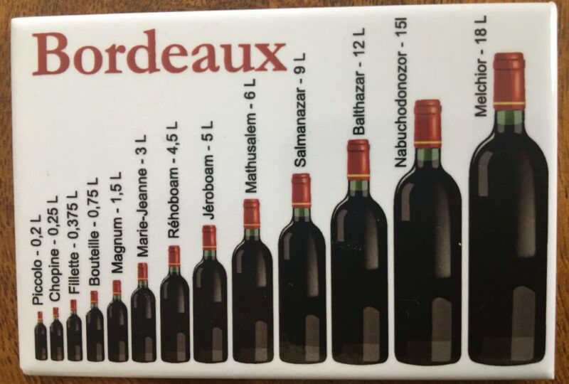
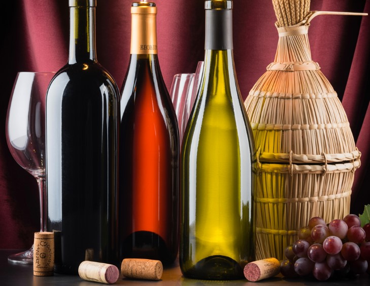
The first is the Bordeaux bottle, this is what most people think of when they picture a “wine bottle.” It has straight sides with pronounced high shoulders and developed in Bordeaux (how fitting) as the traditional choice for Cabernet Sauvignon, Merlot and other Bordeaux-style reds. These high shoulders originally helped catch sediment when pouring, particularly with age-worthy reds.
Although ages-worth reds might be fewer and further between for typical consumers, this original feature has since developed into a universal visual cue for “serious red wine.” When a Cabernet is placed in a Bordeaux bottle, it just feels right; there’s an immediate acknowledgment.
Then there’s the Burgundy bottle, a much softer shape with sloping shoulders and a wider body that tapers at the neck. This is the traditional housing for Pinot Noir and Chardonnay from Burgundy and conveys a different story than its higher-shouldered counterpart. Its softer lines suggest ease and grace.
When producers work with Pinot or Chardonnay, they’re often in search for quality wine bottles for sale that match this shape because they want to align with preconceived notions about their wines. Since this was traditionally the housing for these varietals, the bottle has become part of its identity.
Finally, there’s the tall, slender Alsace or Hock bottle (Riesling uses a similar profile as well). This elongated shape suggests aromatic whites, Riesling, Gewürztraminer and sometimes Pinot Gris, with great strength. The height differentiates these bottles from typical reds or opaque whites, which works well for wines that ought to stand out. The shape says, “I’m different, I’m probably floral or fruit-forward, definitely worthwhile if you’re searching for something special.”
When Regional Associations Can Support Your Efforts
These traditional associations work in tandem with one another but they’re not hard-and-fast rules; sometimes working within them or stepping outside them can create effective results based on what you’re trying to achieve.
If you’re producing a Bordeaux blend, or even a varietal typical to this style, there’s merit in placing it within a Bordeaux bottle. Consumers recognize that shape and immediately think “structured red, likely ages well, perfect accompaniment to dinner.” You’re working with decades of positive associations; there’s great value in that.
However, what if your Cabernet is more intended to be a light-style version? Something fruit-forward instead of tannic, or meant to appeal sooner than later? That heavy Bordeaux bottle might be working against you. Some producers decide at that point to create more of a “Burgundy-style” bottle to suggest “hey! This is your friend’s Cab!” That’s at visual cue level saying “yes, it’s Cab but it’s delightful and approachable right now.”
The key here is recognizing what your wine actually tastes like and what presentation you want to achieve before people take that first sip. The weight and volume should support the liquid in order to connect with the ideal consumers.
The Premium Element That Makes an Impact
Bottle weight is another fascinating nuance about which consumers don’t always consciously think yet their hand absolutely feels it. Grab two bottles, one standard glass on its own and one in a heavier format, and the heavier version just feels special without anyone intending it to be so. This natural reaction happens every single time.
This is why premium wines boast heavier bottles; the weight suggests quality and care before anyone even takes their first sip. However, due to the costs associated with heavier glass, and shipping heavier volumes, this consideration weighs itself against the opportunity and thus, it’s a practical trade-off, perceived luxury versus practical costs.
For wines above $30 retail, the connection becomes clearer; the heavier weight aligns with what’s inside. For wines below that threshold, however, there’s no reason why wines can’t feel nice without being ridiculously heavyweight to feel quality-made. It’s about getting that right balance of what lends itself nicely to your positioning.
Often mid-tier producers find this balance; bottles feel nice without feeling too forced or over-the-top quality for what’s inside.
Quality Control Elements
Color decisions made for your wine also seem purely aesthetic but can also cover some practical considerations as well. For example, dark green bottles or amber glass limit wine light exposure, a critical concern, and this means they make better sense for aged products or wines that might sit on a shelf for longer time spans vs clear glass which shows off the color.
Clear glass works great for rosés or whites where the aesthetic of presentation makes a difference, but clear glass offers no UV protection (your lovely rosé in that clear bottle looks awesome but there’s less protection over time). Clear container wines are typically designed for fresh consumption and thus, lend themselves toward this age perspective.
For traditional Bordeaux varietals, using a green bottle has become second nature because it’s so associated with quality reds, and producers love utilizing it due to its familiarity and perceived red quality elements. Similarly, Burgundy bottles offer a lighter green that’s become part of its regional look.
For whites, this decision offers different possibilities. If it’s a Chardonnay in dark green or amber glass, a serious contribution, that tells consumers this is an aging option (possibly oaked) as well. The same Chardonnay in lighter glass says “it’s fresher” without oak notes.
The key here is using color accordingly, and being cognizant as to whether it might negatively impact preconceived notions when it actually holds great value for presentation purposes.
Creating Unique Distinctiveness

Every few years there comes a winery that creates really unique bottles, flat sides, interesting punts, unusual colors. Sometimes these stick around as iconic presentations but often they’re unique enough to define a brand’s personality.
Custom bottle shapes can work well, but generally only if volume substantiates such an investment. For smaller producers however there are still great options, a specific glass color that’s less common might do well within your category; particular combinations of shape and color can help create recognizable looks that set you apart.
You want people to see your bottle and say, “oh that’s [insert name here]” as opposed to “what an unusual bottle.” The goal here is brand recognition but not via gimmicks, it’s recognition based on true quality options presented.
What Price Point Affords You?
Speaking frankly, if your wine retails at $15 a bottle, you’re operating under certain realities relative to packaging budget decisions. It’s ok; there are plenty of excellent shapes and colors that work well at this price point.
When you’re at $30-$50 retail dollars however you’ve got more flexibility for options; custom embossing; heavier glass; specific colors, these become good options, great options, to create something even more distinctive within branded parameters.
Above $50 retail becomes just as important as the packaging becomes part of the experience, the heavy glass; deep punts; maybe embossing, a heavy investment should match what’s inside.
It’s critical therefore to assess what packaging scenario can best suit your positioning efforts across the board. Great packaging at any price point beats a poor showing when trying to be something you’re not.
It’s About Authenticity
Mid-tier price points show valuable authenticity, excellent showings, with nice heft without being over-the-top high-end.
There must be authenticity in packaging matched by what’s inside, it should honestly represent how much care went into creating what’s inside it.
Market Consistency/Constituencies
What works really well in California could be received differently overseas (and vice versa). Different regions boast different visual expectations, and if you’re reaching out to different markets down the line, this presents exciting opportunities.
For example, a Napa Cabernet presented in a heavy Bordeaux volume reads like “what a premium California red” Australia and New Zealand producers have brought some fun packaging creations (and sometimes screwcaps) come through which lean more toward a Burgundy shape for their Chardonnays/Pinots indicating quality but screwcaps suggesting freshness.
If you’re reaching out to different markets, you may have different packaging solutions for those regions, this takes more forethought, but it can help you best reach expectations therein.
The Sustainability Drive That’s Changing Things Up
Finally, the sustainability conversation. As we become more aware of sustainability (particularly younger wine enthusiasts), decisions about bottles increasingly factor into how people perceive brands, and this creates some innovative considerations, especially regarding social responsibility.
Some premium producers have begun playing with lighter bottles that still feel quality-made; some have moved to clear glass options which boast good recyclability. The challenge lies not alienating perceived luxury from responsible means, different producers find creative solutions based on what may matter most to their wines.
What’s encouraging is that more winemakers think critically about their process decisions, and how these connect with sustainability cred, with sustainability less about making an ideological connection to what you ultimately envision brand positioning-wise, but more about how you can make sustainability work best as opposed to overshadowing it.
Final Thoughts
Ultimately how do you choose? You go on taste. You assess what best represents what’s inside; big heavy structure aged better? A solid choice would be reputable since someone would assume they’ve invested equity into making such choices revered over time. A delicious, aromatic-aged Chardonnay might warrant different options based on regional credibility versus personal preference relative to aesthetics.
Then you take your price point into account; it helps clarify what’s realistically what’s best value for your production efforts.
Then you look at other competitors within your category, not so much as copying them, but understanding what visual landscape makes sense; if something is very popular in your segment in one shape/nature it’s good news to understand rationale behind popularity.
Finally, take long term potential into consideration; whatever you choose should not only work for that vintage, but into the future as brand assessment shows growth over time.
Therefore, finding the best plastic container that represents what works best in that container represents both efficiently for you. If everything aligns successfully between visuals/what’s inside/brand reputation, you’ve successfully acquired an extra team member that works just as hard as you do.