
Captions are no longer optional; they are a core part of modern video communication. From social media reels to product explainers, captions improve accessibility, retention, and viewer comprehension. However, placing captions incorrectly can hide faces, cover CTAs, or clash with platform UI elements.
This guide explains where to place captions so nothing gets covered, helping creators design clean, readable text overlays that enhance rather than disrupt the viewing experience.
Whether you’re producing vertical shorts or long-form videos, understanding caption placement is essential for professional results.
Why Caption Placement Matters More Than Ever
Caption placement directly affects how viewers consume your content. With most videos watched on mobile and often without sound, captions guide attention. Poor placement can block facial expressions, hide products, or overlap platform buttons like “Follow” or “Subscribe.” Strategically positioned captions improve clarity, increase watch time, and reduce viewer frustration.
Beyond usability, placement impacts branding and conversions. If captions cover logos or CTAs, you lose valuable visual hierarchy. Algorithms also favor watch-through rates, so readable captions indirectly support discoverability. The key is balancing visibility with respect for the video’s visual focal points. By planning caption placement early in the editing workflow, creators ensure captions support the story instead of competing with it.
Key considerations include:
- Screen size variability
- Platform UI overlays
- Visual focal points (faces, products, actions)
Understanding Safe Zones Across Platforms
Every platform has “safe zones”, areas where text won’t be obscured by UI elements or cropping. Ignoring these zones is one of the most common caption mistakes. For vertical videos especially, captions placed too low risk being covered by buttons or descriptions.
Here’s a simplified comparison:
|
Platform |
Recommended Caption Area |
Risky Zones |
| TikTok | Middle-lower third | Bottom 20% |
| Instagram Reels | Center third | Bottom + right |
| YouTube Shorts | Lower-middle | Bottom bar |
Placing captions within safe zones ensures consistency across devices. Editors should preview videos in platform-specific mockups to confirm placement. Treat safe zones as design constraints, not limitations; they help captions stay readable without interfering with engagement elements.
Choosing the Right Caption Position for Different Content Types
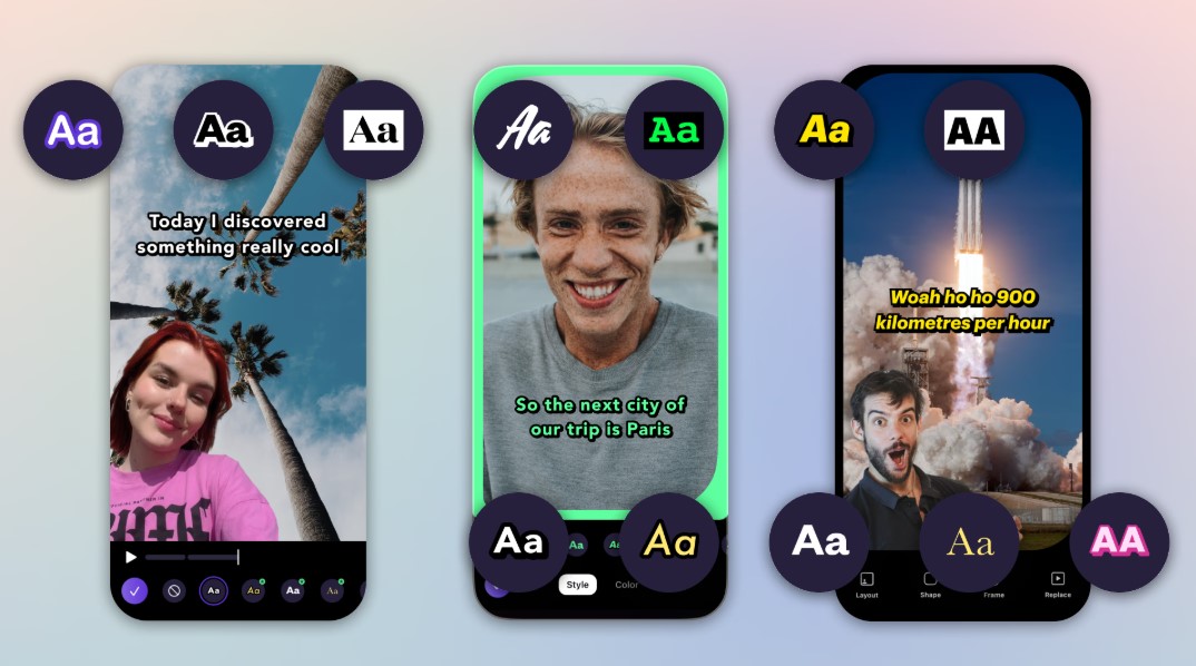
Not all videos benefit from the same caption placement. Talking-head videos often work best with captions in the lower third, while tutorials may require dynamic placement that follows the action. The goal is to avoid covering what the viewer needs to see most at any moment.
For example:
- Talking-head videos ─ Lower third, centered
- Product demos ─ Upper third to avoid hands/products
- Screen recordings ─ Margins or top overlay
Dynamic placement can improve clarity but must remain consistent to avoid visual fatigue. Always prioritize the subject of the frame. If captions compete with key visuals, viewers may disengage. Smart placement adapts to content, not the other way around.
Did you know?
Eye-tracking studies show viewers naturally scan the center of the frame first, making mid-screen captions more noticeable when used sparingly.
How to Add Text Without Blocking Visual Elements
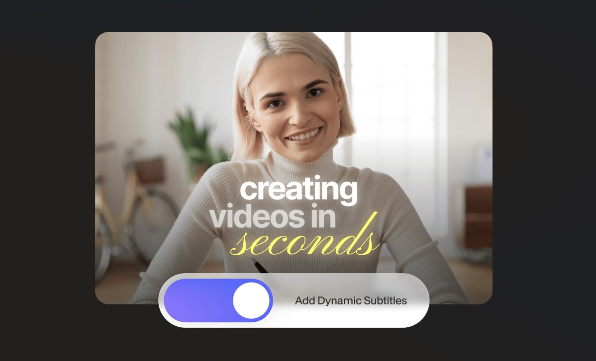
Modern editing tools make it easier than ever to add text to video while preserving visual clarity. When you use tools like Promo, you can preview captions in real time and adjust placement before exporting. This reduces the risk of covering faces, graphics, or CTAs.
To effectively add text to video:
- Use semi-transparent caption backgrounds
- Adjust line breaks to reduce height
- Keep captions within safe margins
Testing captions on multiple devices is critical. What looks fine on desktop may feel cramped on mobile. Always export a draft and review it as your audience would. This workflow ensures captions enhance the message instead of obstructing it.
Font Size, Line Length, and Readability Balance
Placement alone isn’t enough; caption design affects coverage, too. Oversized fonts or long sentences can spill into unwanted areas even when placed correctly. Optimal readability comes from balancing size, contrast, and line length.
Best practices include:
- Limit captions to 1–2 lines
- Use high-contrast colors
- Avoid all-caps for long text
Captions should be readable at arm’s length on a phone. If viewers need to strain, they’ll scroll away. Shorter captions also allow more flexibility in placement, reducing the chance of covering important visuals. Think of captions as supporting elements, not the main attraction.
Dynamic Captions vs. Static Captions ─ What Works Best?
Dynamic captions, where text moves or changes position, can help avoid covering key visuals during different scenes. However, overuse can feel chaotic. Static captions are calmer and easier to follow but may clash with scene changes.
Dynamic captions work best when:
- The subject moves around the frame
- Multiple focal points exist
- Content is fast-paced
Static captions work best when:
- The frame is stable
- The subject is centered
- The message is educational
The ideal approach is moderation. Subtle shifts in placement between cuts can preserve clarity without distracting the viewer. Always test playback to ensure motion feels intentional, not accidental.
Accessibility and Compliance Considerations
Caption placement also affects accessibility. Viewers with cognitive or visual impairments rely on predictable placement and clear contrast. Moving captions too frequently can reduce comprehension, while placing them over busy backgrounds lowers readability.
Accessibility-focused tips:
- Maintain consistent placement
- Use solid or blurred background boxes
- Avoid overlapping essential visuals
Some platforms and regions have accessibility guidelines that favor bottom-center placement. Designing with inclusivity in mind not only broadens your audience but also improves overall user experience. Clear captions benefit everyone, not just those watching without sound.
Conclusion
Effective caption placement is a blend of strategy, design, and testing. By respecting safe zones, adapting placement to content type, and balancing readability with visual clarity, creators can ensure captions never cover what matters most.
Thoughtful placement improves engagement, accessibility, and professionalism.