

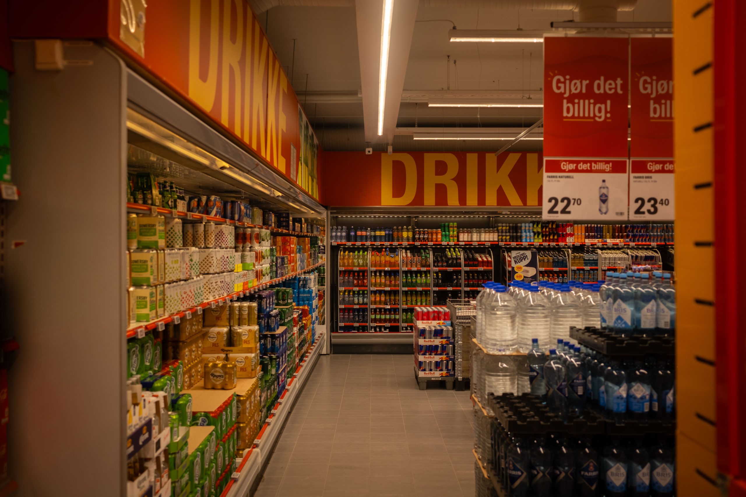
There is a particular kind of silence that happens when a founder stands in an aisle and watches shoppers walk straight past their product. You can rehearse the packaging pitch all you like. On the shelf, the product is on its own, and it never gets to explain itself.
Here is the number worth resetting your thinking around. A 2020 eye-tracking study published in the GRID journal reports that roughly 70% of purchase decisions happen inside the store, and that a package has somewhere between two and three seconds to make its case. Most of that decision is made before anyone reads a word of your copy.
So this guide is not about making your packaging prettier. It is about the handful of visual and physical levers that actually change whether a hand reaches for your product. Some cost money. The most useful ones cost only attention.

The shelf is a scanning test, not a reading test
Shoppers do not read shelves. They scan them while walking, usually from an angle, often in poor light, with a mental shopping list running in the background. The practical version of this comes from the merchandising world: a package should grab attention from roughly ten feet away, communicate its value at five feet, and only then win the comparison at arm’s reach (Digital Commerce 360, 2026).
Eye-tracking makes the scale of the problem obvious. In the widely cited Chandon, Hutchinson and Young experiment that put shoppers in front of a simulated orange juice display, people registered on average 10.9 of the 16 brands on the shelf and genuinely considered only 2.5 of them. About a third of the packages were never looked at, not once. The same research found a clear pattern: the more times a package was fixated on, the more likely it was to enter the consideration set.
That is why “we have a great product” is not a shelf strategy. Nobody on the aisle knows the product is great. They know only what the package shows them in the time it takes to take one step.
Contrast beats bold, and the distinction matters
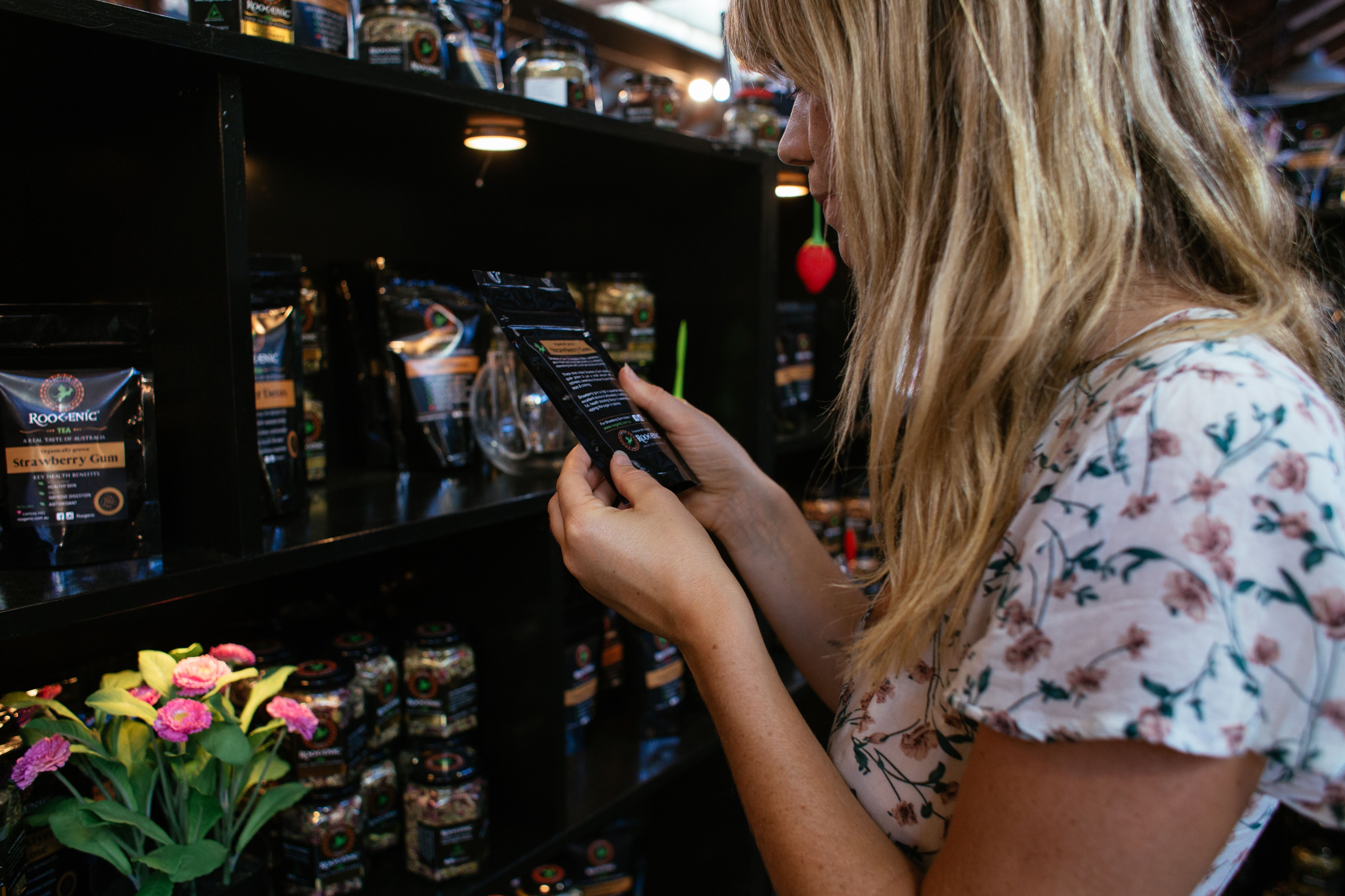
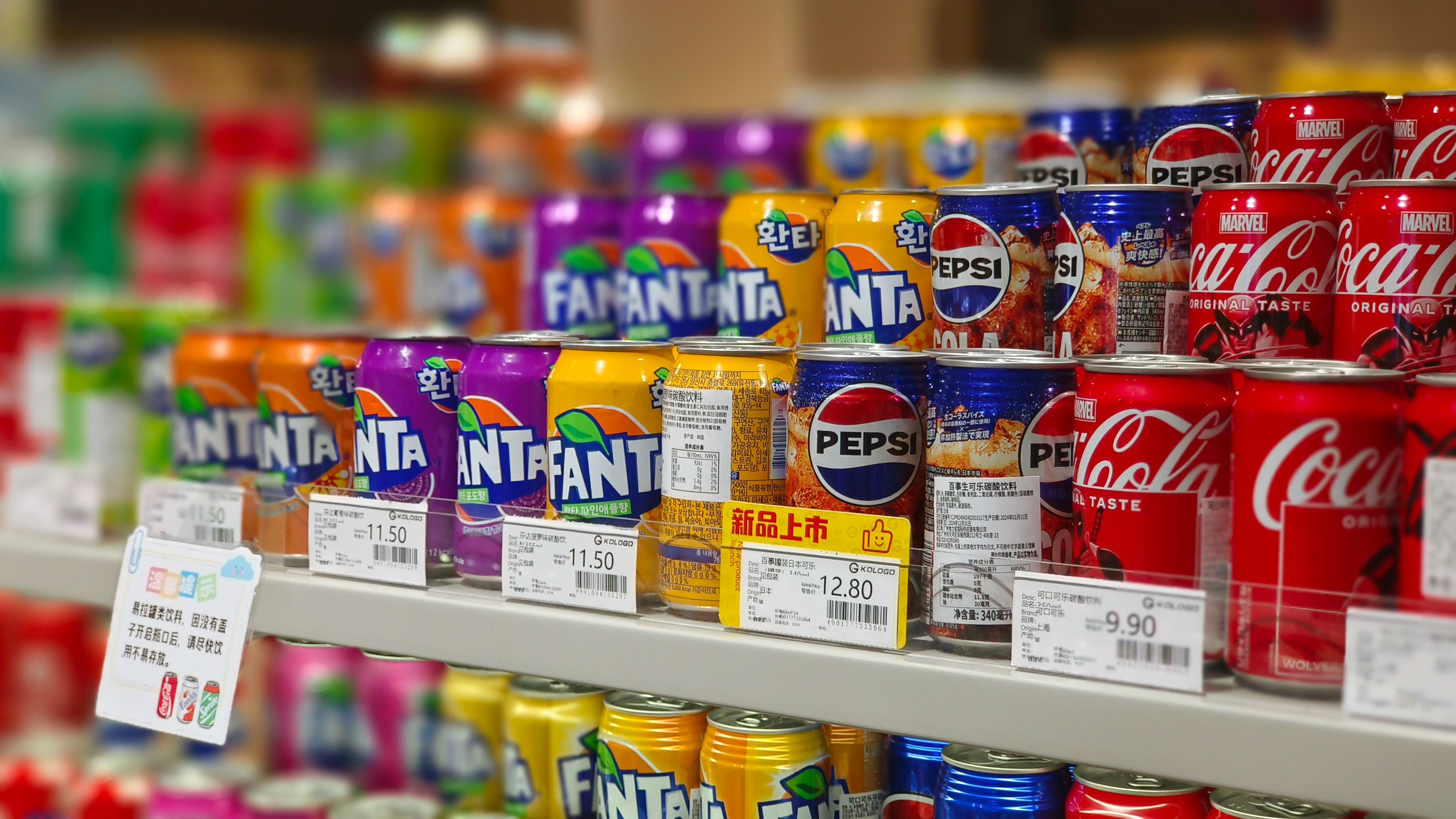
The most repeated piece of packaging advice is some version of “use bold colors and big type.” I think that advice is half wrong, and the half it gets wrong is the useful half. The human eye does not register absolute loudness. It registers deviation from a pattern. Put one bright pack in an aisle of bright packs and you have built camouflage, not a beacon.
So the first design question is not “what color do I like?” It is “what does the shelf next to me actually look like?” Photograph your category’s shelf, print your top five competitors, and lay them out together. If the whole category leans kraft-brown and earthy, a clean saturated color will pop. If everyone already screams, restraint becomes the disruptive choice. A 2024 Behaviorally analysis of the spirits aisle made the same point from the other direction: Maker’s Mark sat in a less favourable upper-left position yet stayed among the most-seen bottles, largely because that red wax seal broke the pattern.
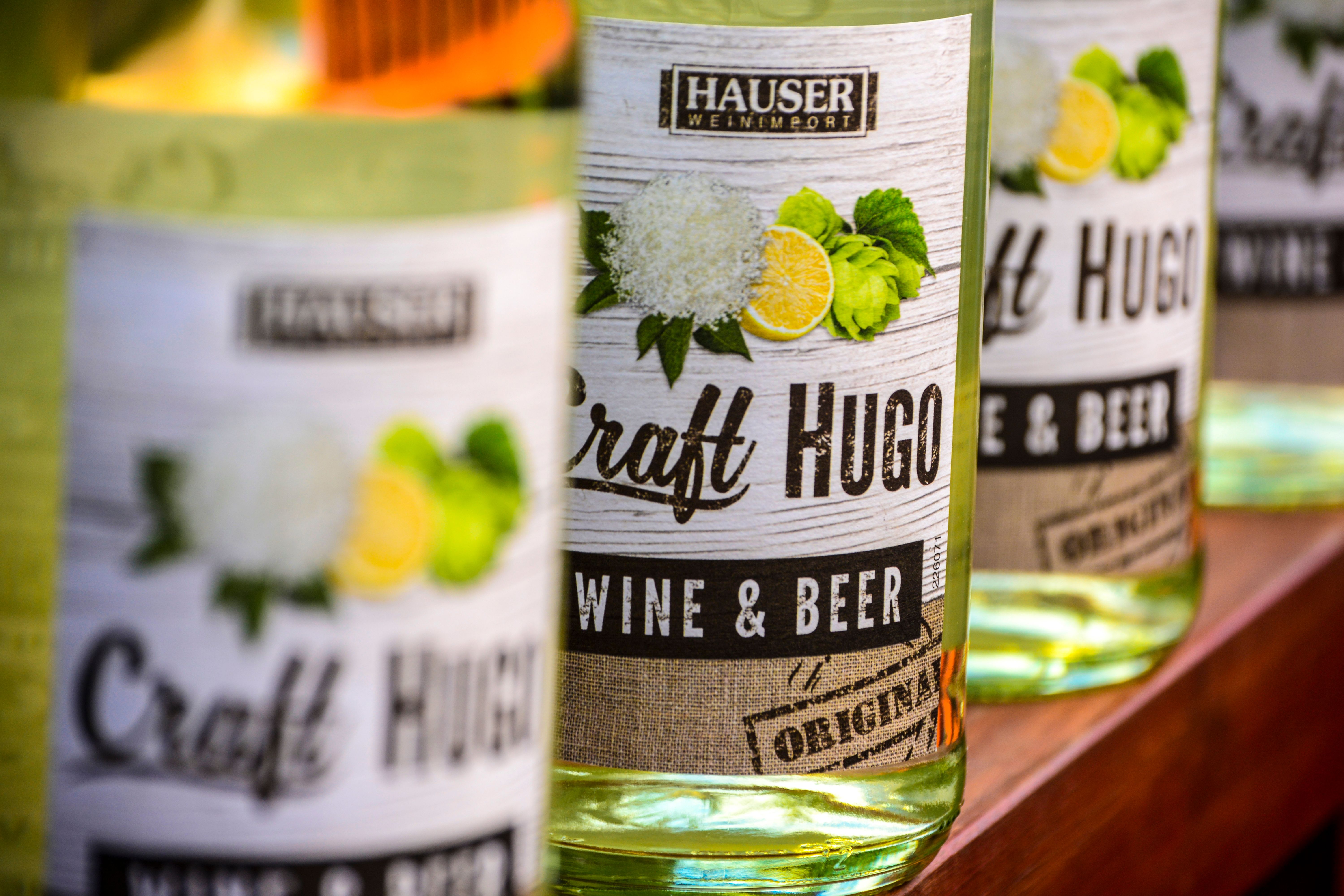
One caution, because this is where small brands overcorrect. Contrast is not the same as clutter. A 2026 eye-tracking study published in the journal Vision found that transparent windows, which let the product itself do the talking, pulled attention faster and produced higher purchase intention than a printed product image on the front. The lesson is not “add a window to everything.” It is that a single strong, legible signal outperforms five competing ones. Pick one hero message for the front panel and let everything else serve it.
Why an off-shelf display can beat a better label
Most small brands pour all their energy into the front panel and ignore the question of physical placement, which is where the odds get friendlier. On the main shelf you are competing against however many facings your category leader controls. Move the product off the shelf entirely, onto the floor in a high-traffic spot, and you are suddenly competing with a bare patch of carpet.
This is the logic behind secondary placement: endcaps, aisle intersections, entrances, and checkout zones. Open-top cardboard formats such as dump bins for retail stores work on a different shopper behaviour than a shelf does. A shelf asks people to stop, scan and compare; a dump bin invites a browse-and-grab, where the product is loose, abundant and easy to reach. For high-volume, low-price, impulse-friendly items, that difference in friction is the whole game, and the format restocks fast enough that store staff tend to tolerate it.
Secondary placement is not a substitute for a good label. It is a way to earn attention you could not buy on the shelf, and for a small brand with no negotiation leverage, that trade is often the single best one available.
Facings and placement: the lever you can actually measure
If you only fix one thing after reading this, make it the number of times your product appears on the shelf. In the Journal of Marketing study on shelf facings, Chandon and colleagues found that adding facings had a strong effect on how brands were evaluated, and that the entire effect ran through visual attention. More facings meant more looking, and more looking meant more consideration. Crucially, the effect was strongest for low-market-share brands and infrequent buyers, which is precisely the situation most small businesses are in.
The study also found that shelf height is not neutral. Top and middle positions drew more attention than low ones, though only top-shelf positions carried all the way through to a better evaluation.
| Shelf zone | What the research suggests | Practical read for a small brand |
|---|---|---|
| Top / stretch (roughly above 1.8m) | High attention, and in one study the only zone where attention converted into stronger evaluation (Chandon et al., 2009) | Worth fighting for, harder to reach physically |
| Eye level (about 1.2–1.5m) | Consistently strong attention; the basis of the “eye level is buy level” rule | The default target in most planogram negotiations |
| Touch / waist (about 0.9–1.2m) | Performs well in several field studies; easy to reach and handle | A realistic compromise if top shelf is locked up |
| Bottom / stoop (below roughly 0.9m) | Weakest attention across most eye-tracking work | Accept it only with extra facings or an off-shelf display |
Source: Chandon, Hutchinson and Young (2009), with shelf heights as commonly defined in retail merchandising research. Figures reflect general tendencies across categories, not a guarantee for yours.
“Eye level is buy level” has an asterisk
The standard advice to fight for eye level is broadly right, but it is stated with more certainty than the evidence supports. A field experiment in two Iceland budget stores, published by Sigurdsson and colleagues and available via the National Library of Medicine, moved a potato chip brand between high, middle and low shelves. Middle shelf won on sales, but the gaps were modest, and an extra off-shelf line-up at the store entrance beat every shelf position by a wide margin.
Then there is the wrinkle. A 2023 North American convenience store field experiment found that moving a product to eye level lifted sales by 5.6% or 10% depending on where it came from, but only under one specific planogram reorganization. Under a different one, the eye-level effect vanished. My read: placement is contextual, not a law. The position matters less than whether the product is near where a shopper’s eyes already go in that particular store. Which is why a planogram change you cannot control should never be the centrepiece of your strategy.
Shelf-ready packaging: the unglamorous box that decides your facings
Here is a detail most first-time founders miss entirely. Retailers are not only judging your product; they are judging how much labour it costs to put your product on the shelf. That is why shelf-ready packaging (SRP, sometimes called retail-ready packaging) has shifted from a nice-to-have to an expectation at many chains. It is secondary packaging that goes from the delivery pallet to the shelf with a perforated tear, no individual unpacking, no rearranging.
At the 2025 PLMA trade show, Lidl US CEO Joel Rampoldt put it bluntly: “Shelf-ready packaging is core to who we are as well.” The industry shorthand for what retailers want is the “five easies”: easy to identify, open, stock, shop and dispose of. Get those right and you make a store manager’s day measurably shorter. That goodwill is real leverage when facings are being allocated.
If you sell through grocery, club or discount channels, ask your buyer about SRP expectations before your packaging is locked. This is a structural decision, and retrofitting it is expensive.
Structure and texture: the 90cm test
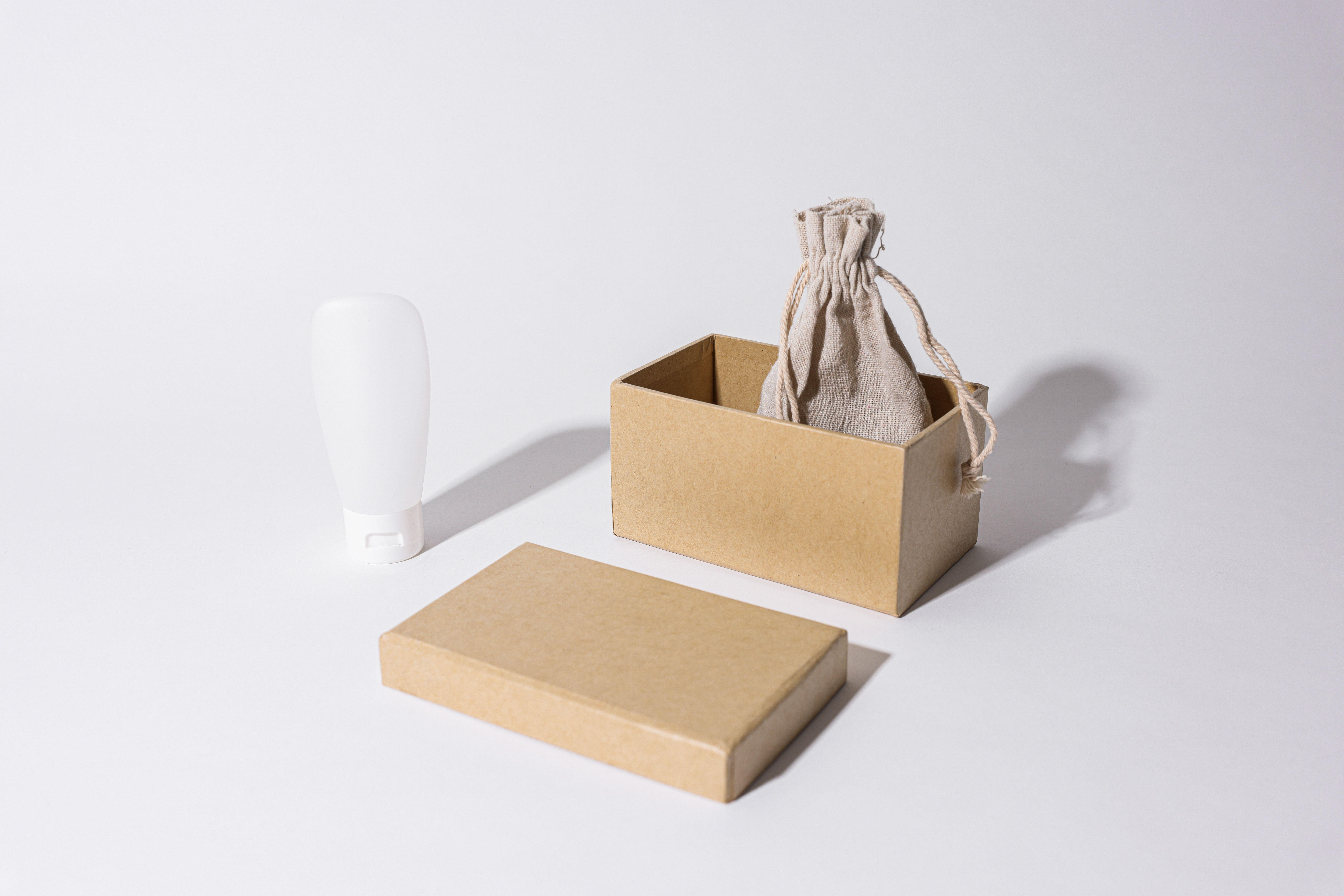
Color and type get you noticed. Structure is what makes you physically different from a wall of near-identical boxes. A distinctive silhouette, a vertical rather than horizontal orientation, a window, a matte finish on a glossy category, or a tactile element all separate you in peripheral vision, before any label is read.
Whatever you design, stop judging it on a monitor. Print your front panel at actual size, place it on a table between your top competitors, and step back about 90cm. Can you read the brand name, the product name and the single main benefit within three seconds? Ask someone who has never seen your brand to do the same and tell you what they remember. If they cannot name the product, the design is not finished, no matter how much you like it.
Where small brands genuinely beat the big ones
Large brands win on familiarity, distribution and shelf space. They routinely lose on one thing: feeling human. Shoppers have grown sceptical of packaging that makes a dozen loud claims, and a 2024 digital commerce analysis noted that clear windows, plain factual type and honest material choices build immediate rapport in a way that over-designed graphics do not.
A single specific detail on the pack, an ingredient origin, a maker’s name, an unexpected illustration, can communicate more in half a second than a paragraph of brand story ever will. Small brands should not try to look bigger. They should look like a real person made the thing, because that is the one advantage the category leader cannot copy.
What I would not do
I would not commission a full rebrand because a product is not selling. Most underperforming packages have one or two specific faults: a product name that is too small, a color that turns to mud at distance, a logo too detailed to register quickly. Those are fixable surgically, and a targeted fix is usually far cheaper than a redesign that throws away the recognition you have already earned.
The exception is when the current packaging was built with no clear hierarchy at all. Patching a design with no foundation produces diminishing returns, and starting over is the more efficient path. The honest test is whether you can name, in one sentence, what the package is supposed to communicate first. If you cannot, neither can a shopper.
A shelf test you can run this week
- Photograph the real shelf. Take a photo of the exact spot your product sits or will sit, with the neighbours in frame.
- Assemble a competitor set. Print your top five rivals at actual size and put your design among them.
- Do the 90cm and the 3m checks. Can you identify brand, product and main benefit at close range and from across the room?
- Convert to grayscale. If your layout turns into a flat grey blob, your internal contrast is too weak.
- Ask five strangers. Show the shelf set for three seconds, then ask what they noticed first and what the product is.
- Count your facings. Ask the buyer how many facings you hold and whether a secondary floor display is possible.
- Fix one thing, then re-test. Change the single biggest failure and run the same test again.
Frequently asked questions
How long do I really have to catch a shopper’s attention?
Count in seconds, not in minutes. Eye-tracking research puts the usable window at roughly two to three seconds, and many shoppers spend less because they are scanning while walking. Design the front panel so the brand and the product are understandable in a single glance.
Should I use bold, bright colors to stand out?
Only if your category does not already. Brightness is relative. The reliable principle is contrast against the actual shelf you will sit on, so study your direct competitors before choosing a palette. In a loud category, restraint can be the loudest move you make.
Does shelf position matter more than packaging?
They compound rather than compete. Position decides how many people look in your direction; packaging decides whether they stop. That is why the strongest small-brand move is often extra facings or a secondary off-shelf display, which changes the attention you get without a full redesign.
What is shelf-ready packaging, and do I need it?
Shelf-ready packaging goes from the case straight to the shelf with minimal handling, saving retailers labour. Many grocery, club and discount chains now expect or require it. If you sell into those channels, confirm the requirement with your buyer before you commit to a print run.
How can I test packaging before paying for a print run?
Print full-size proofs, place them beside your real competitors under ordinary store-like lighting, and test at both arm’s length and several metres. Ask people unfamiliar with your brand what they noticed and what the product is. Fix the failure the test reveals, not the detail you happen to dislike.
How this article was put together
This piece set out to answer one question for small brands: what actually changes whether a product gets picked up? It draws on peer-reviewed eye-tracking research, a 2024 category study, a 2025 industry show quote and current retailer packaging standards, all checked in September 2026. Where a figure comes from a single study or a commercial source, that is stated in the text. The one commercial link in this article is a client placement for a display manufacturer; no other relationship shaped the advice. Shelf and packaging research dates quickly, so recheck any statistic older than about three years before citing it yourself.